| |
|
|
What is true mobile friendly design?
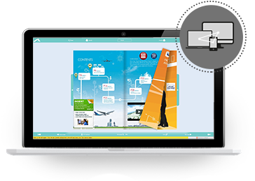
Publish magazines, flyers, catalogs, brochures or other documents online with pages that flip, so it is essential to the online publication automatically be adapted to monitors and resolution on readers´ device.
There are two ways for mobile publishing
The correct way is that the online publication web link (URL) is always the same regardless of whether the used PC, Mac or mobile devices.
There are solutions, which provide multiple disadvantages, and the web link (URL) redirects to an alternative mobile version (example; www.m.your_online_publication.com).
For example, your website will not get higher rank on search engine result lists, tracking codes for statistics more complicated, higher costs for online marketing, more maintenance, and other areas.
Read more about your benefits »
How do I test for mobile friendly design
It is incredibly simple, and you can check through the browser on your PC or Mac.
Open the online publication in a browser on your PC or Mac, and resize the window, and you can immediately see whether the online documents and menus are changing to the size of the browser.
Therefore, check to see if the link to the online publication is the same, regardless of whether your readers using mobile devices or desktop computers.
Read more about mobile friendly design on Google »

MOBILE FRIENDLY
Real mobile friendly design only use one web link (URL) for all electronic devices!

Test for true mobile friendly design
by changing the window size in the browser!
Benefits of pure mobile friendly design?
Publish any magazines, catalogs, brochures, flyers and other documents, on PC, Mac and mobile devices with only one web link (URL).
We have collected some advantages of online publications, which adapts to the size of screens and resolution.
- Search engines using keywords for viewing and links on result lists, regardless of whether it is a mobile device or desktop computer.
- Tracking codes are easier to administer and records searches and traffic on all electronic devices.
- Online marketing is cheaper and more efficient, as campaigns for desktop computers and mobile devices are the same.
- Your online publication helps your entire Web page when published from your web host/site, read more »
- Maintenance and updates of the online publication are simpler and faster since as only one-version needs to updates.
Talk to your keyword specialists, which immediately will recommend the pure responsive design for catalogs, brochures, flyers, magazines, and other documents.
View mobile friendly online publication on a
tablet PC in real-time simulation »
View mobile friendly online publication on a
mobile in real-time simulation »
It is your website rewarded by search engines ' results lists.
You get cheaper online marketing by advertising.
Tracking codes for statistic are easier to manage.
Online publication horizontally with flipping pages
in real-time simulation on a tablet PC
Online publication vertically with flipping pages
in real-time simulation on a tablet PC
Online publication horizontally with flipping pages
in realtime simulation on a mobile
Note, that simulation via a desktop browser
may be only be optimized for mobile devices!
Online publication vetically with flipping pages
in real-time simulation on a mobile
Note, that simulation via a desktop browser
may some features only be optimized for mobile devices!
Example, flip pages using the finger touch.
|
|